


CH.2
CH.1
Modern
Dentistry
Redefined.
INTRØDUCTION
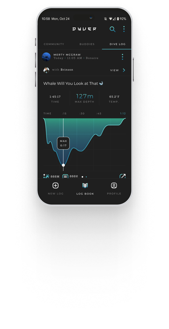
Dyver is more than a habit tracker—it's a
daily ritual of self-care. We created a visual system that honors every step of your flexibility journey with calm, clear, and motivating rewards.
⇓
— CHAPTER ONE —
BRANDING
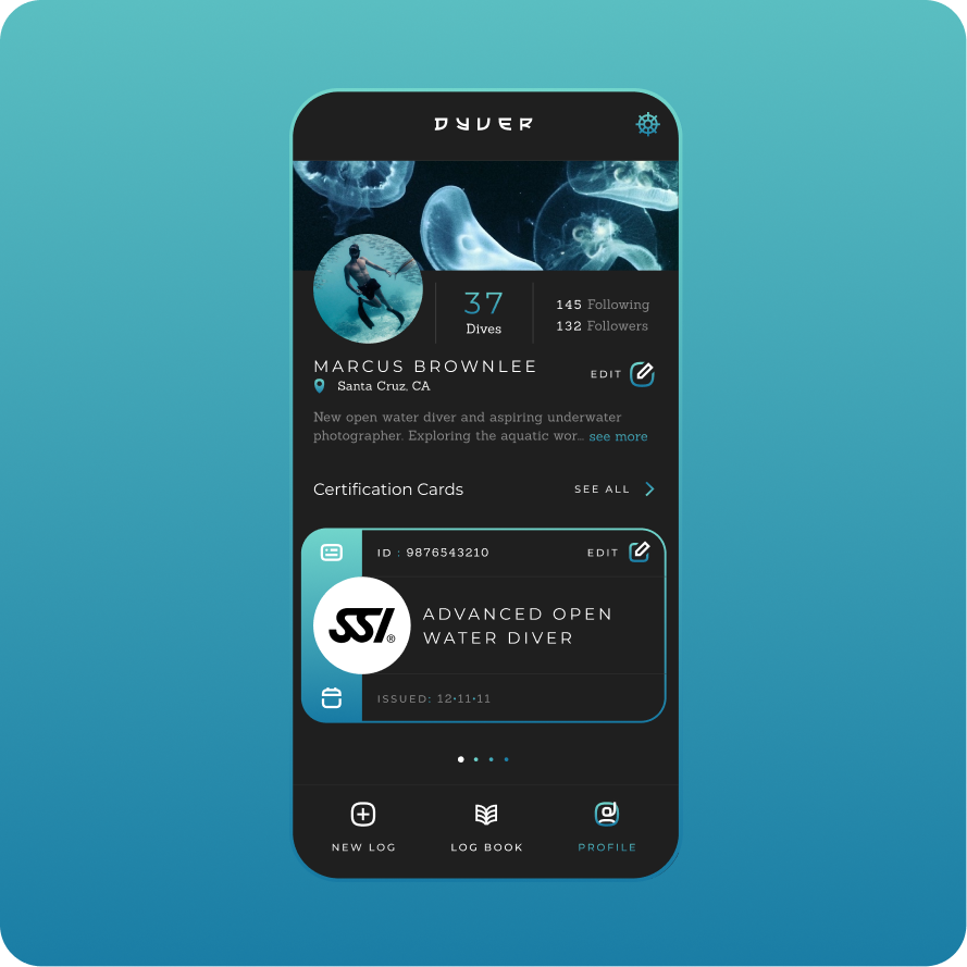
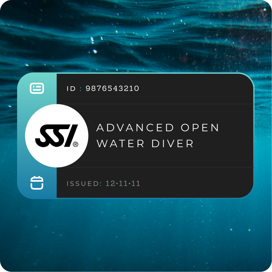
Deep Dive into the App
Logo

Logo variations
The logotype refers to the typography that makes up a logo. The Dyver logotype is made from a set of stylized character glyphs that give it an instantly recognizeable look. The letters can be arranged in a classic right to left horizontal layout or in a top to bottom vertical layout.
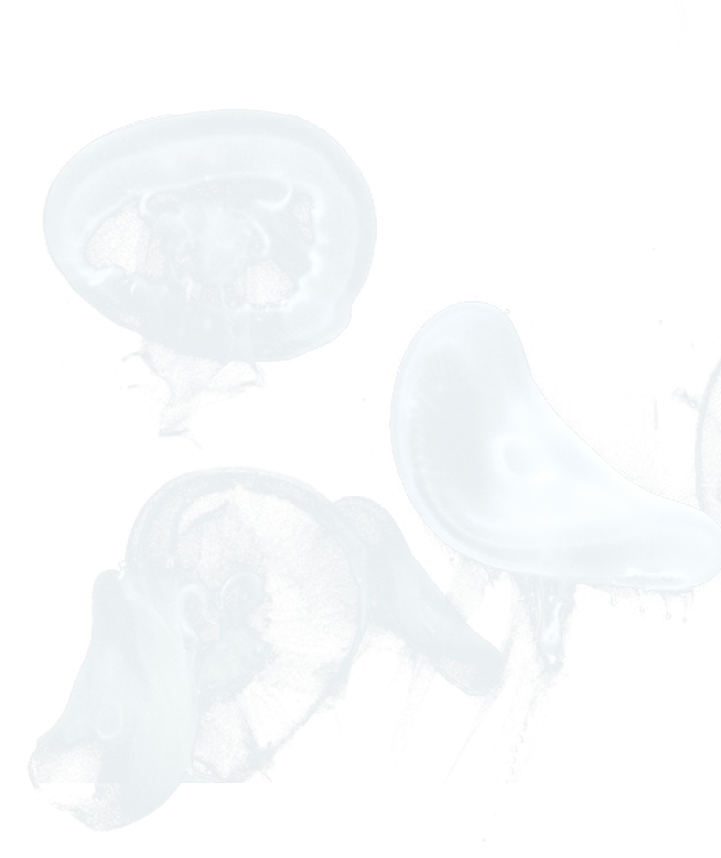
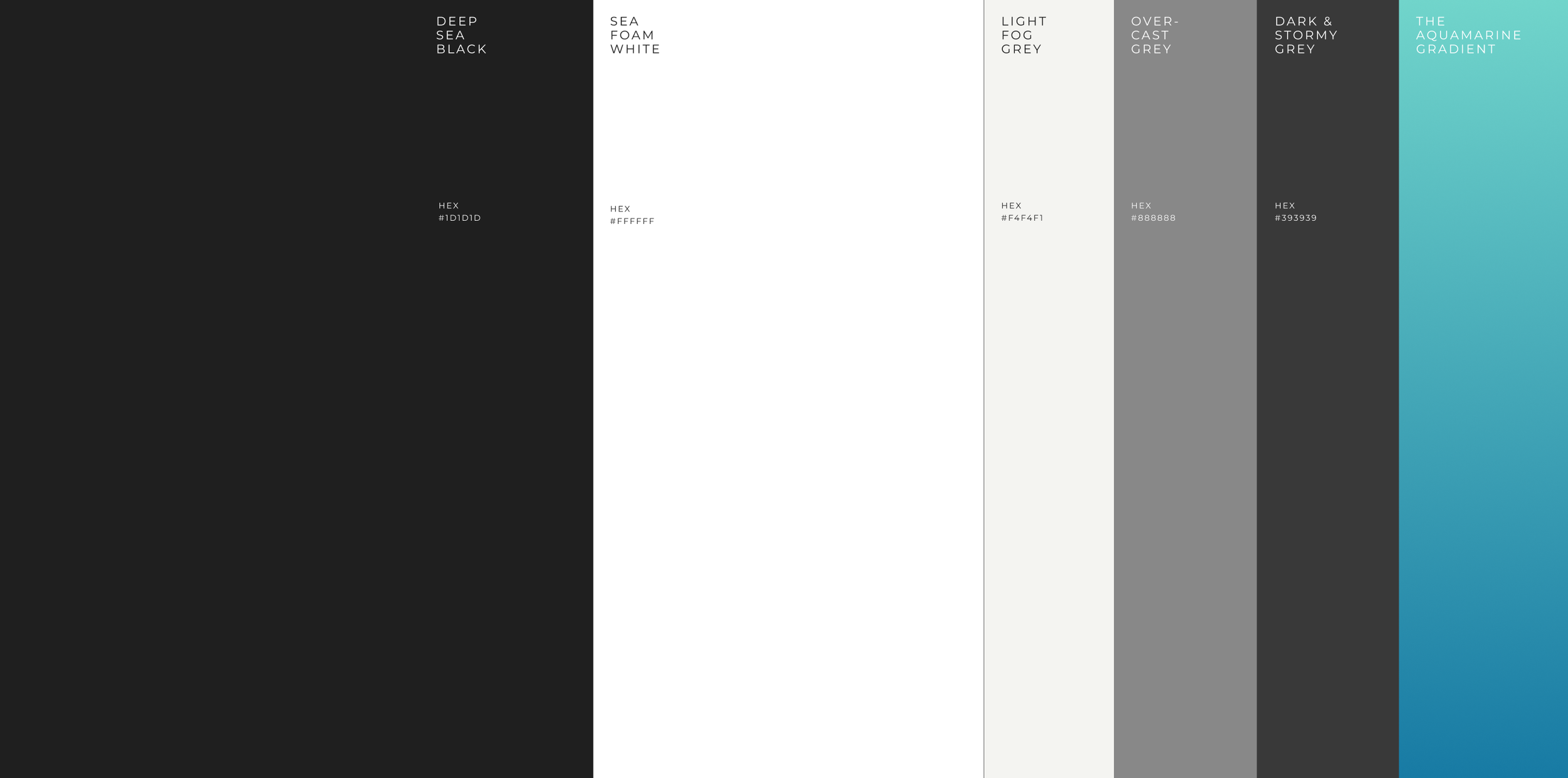
Colours
The color palette was carefully developed to reflect their core values of vibrancy and transformation.

Stretch is more than a habit tracker—it's a daily ritual of self-care. We created a visual system that honors every step of your flexibility journey with calm, clear, and motivating rewards.
— CHAPTER two —
Product
Deep Dive into the App
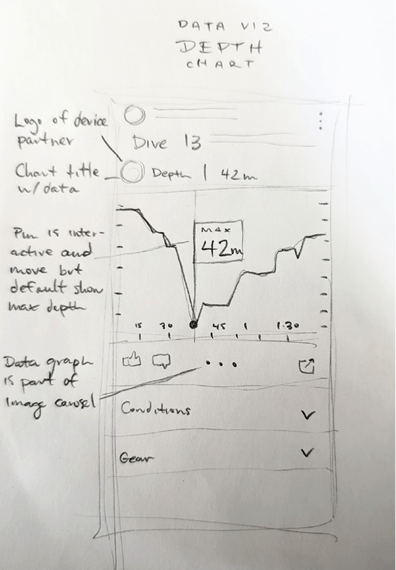
Step 1.
Sketching & Wireframes
I begin by translating abstract concepts into tangible forms through rapid sketching and wireframing. This is something I also love to involve the whole team with to make sure we explore all ideas, even from non-designers. This iterative process allows me to explore various design directions, prioritize key features, establish a foundation for the user interface and make decisions quickly with my team.
Step 2.
Ideation & Analysis
Ideation is a crucial stage where I dive deeper into brainstorming and concept development. I employ techniques like user journey mapping, and competitive analysis and benchmarking within the industry to generate innovative solutions that address all the possible user needs and also align with business goals. This is where I get lots of ideas out quickly and make decision on which directions we want to actually build.
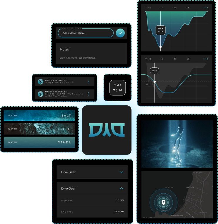
Step 4.
Production Design
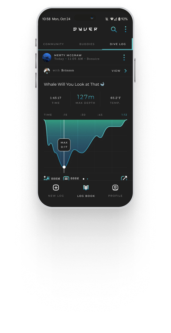
To bring the designs to life and test their usability, I create interactive prototypes out of the high fidelity designs. These prototypes allow me to simulate real-world user interactions and gather valuable feedback with testing.
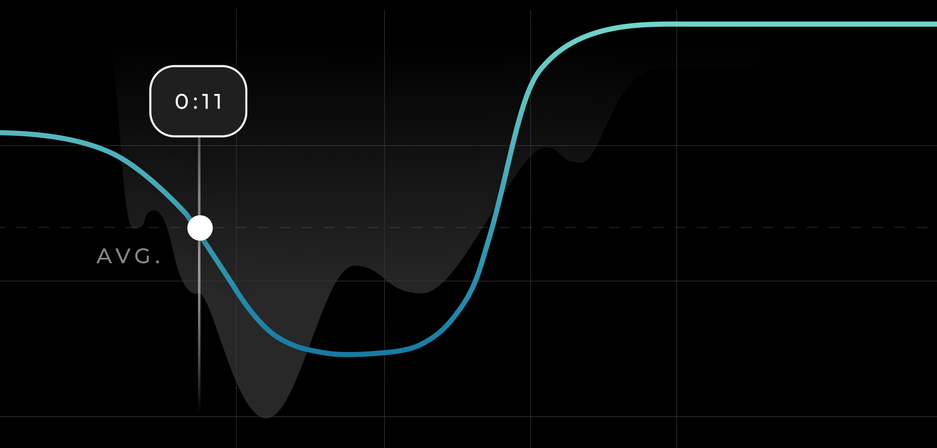
Step 3.
Designs Systems
I then break down the designs into components and meticulously craft high-fidelity elements that reflect the visual language and interaction patterns of the brand while also playing close attention to structural systems that the pre-existing product is built within and upon. This involves consideration of all our grids, pre-existing compenentry, branded type stack, color palette, and overall brand aesthetics.
NEED YOUR OWN BRAND IDENTITY?
That’s our specialty. Let’s collaborate and put a smile on your face too.
The Team
Creative Director | Design - Brinson McGowan
Creative Director | Design (Client) – Dr. Andrew Fakhoury