

Proyect overview(N° 004)
SOLSEED
MYSTERY
SCHOOL
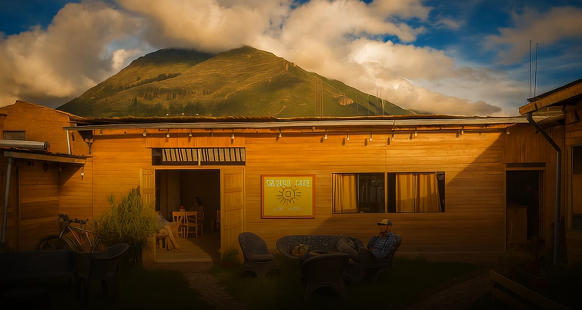
Upspiral came to us with a clear mission: to match their transformative purpose with a visual identity that felt just as powerful. We set out to elevate their entire brand ecosystem, ensuring it inspired their community and attracted new members on a deeper level.
— CHAPTER ONE —
exploration
Birthing THe Brand

MOODBOARDS
Laying the Foundation
We started by curating visual references that captured Fieldman's soul—heritage, grit, and 1950s Americana. These moodboards helped align vision, tone, and emotional depth with the founder’s story.

LOGO EXPLORATION
Drafting the Identity
Early concepts explored hand crafted letterforms, textures, and type styles that echoed vintage signage and workwear labels. Each design direction aimed to feel both nostalgic but also personal and modern.

FINAL LOGO EXPLOratION
A hand made logo for hand made fashion.
The final logo blends hand classic drawn typography with nostalgic movement & warmth. It’s a modern homage to the past, grounded in authenticity and built to last.


SAFE SPACE
Structure with Freedom
That’s it for the
A flexible identity system was created with spacing guidelines and lockups to ensure consistency across all applications—without sacrificing the personality of the hand-drawn mark

Classic Americana
Modern Tones.
COLOR PALETTE
Inspired by worn denim, sun-faded labels, and vintage packaging, the palette combines earthy greens, bold reds, and creamy neutrals to evoke familiarity and soul.

Looking to explore your own branding?
You’re in luck, this is our favorite kind of work, feel free to reach out to our team if watching our process inspired you?